Visualizing Climate Change
Climate Signals and Hurricane Matthew, 10-2016 (credit: Climate Signals)
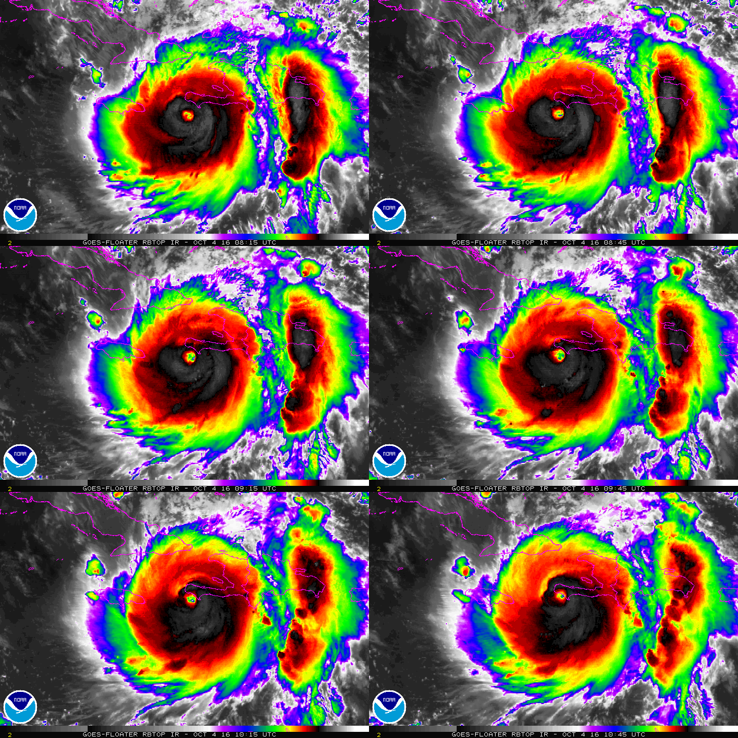
Ecologists, climate scientists, oceanographers, and other researchers are always being asked if a given weather event was the result of climate change. Till now, the question has been answered by saying that the 'amplitude' of an extreme weather event was increased by the altered atmospheric or oceanic conditions from greenhouse gas pollution but the extent was not known. Hurricane Matthew was a test case for the computer models testing various big data measurements to determine a better answer.

Hurricane Matthew, October 2016 (credit: NOAA)
The non-profit organization Climate Signals has developed a series of interactive infographics to visualize the factors linking extreme weather to climate change influences. Their diagrams don't quantify the relative strength of a given factor or local influencers like mountains but they provide a good indication of the impacts to expect as climate change accelerates. Using "climate signals" influencing Hurricane Matthew, an interactive graphic shows how each one affected the other. The extreme weather brought heavy destruction wherever the hurricane hit due to these interacting environmental factors.
Climate Signals has also synthesized a series of additional climate change infographics including one on wildfire risk. That visualization predated a report on climate change and wildfire risk published by Proceedings of the National Academy of Sciences that draws many of the same conclusions. The extent of intense fire events in the Western USA show how climate change predictions, due to unfold 30 years from now, are starting to happen today.
This is not a pretty picture.
WHB