Global Ice Melting Visualized
Greenland ice cap (credit: JPL)
What would Greenland look like without ice? An animation produced using radar data of the ice cap, showed hidden canyons that are increasing the flow of melt water into the North Atlantic ocean.
According to the Jet Propulsion Laboratory (JPL) in Pasadena and the University of California at Irvine, canyons under western Greenland's glaciers are much deeper and longer than previously thought. If all the ice covering Greenland covering the canyons melted, the amount of water flowing into the North Atlantic would raise sea levels substantially. Mathieu Morlighem, the lead investigator with the ice sheet modeling group at the University of California said:
"The glaciers of Greenland are likely to retreat faster and farther inland than anticipated, and for much longer, according to this very different topography we have discovered.”
Greenland's ice sheet contains nearly 700,000 cubic miles of ice and if it were all to melt, global sea level would rise nearly 25 feet. These recent results should interest cities, regions, and people living along the Atlantic Ocean and elsewhere coastal. Complete analysis of changes to the Greenland ice cap and its melting rates is here and an animated visualization of the radar data shows the exposed canyons.
Mass balance of the Greenland ice sheet, 1992-2018 (credit: JPL)
The latest report from the Intergovernmental Panel on Climate Change (IPCC) presented the their findings of climate change impacts that are already being observed and which are expected to increase with continuing climate warming. One IPCC graph offered five scenarios for temperature increases and the impacts on past and future generations.
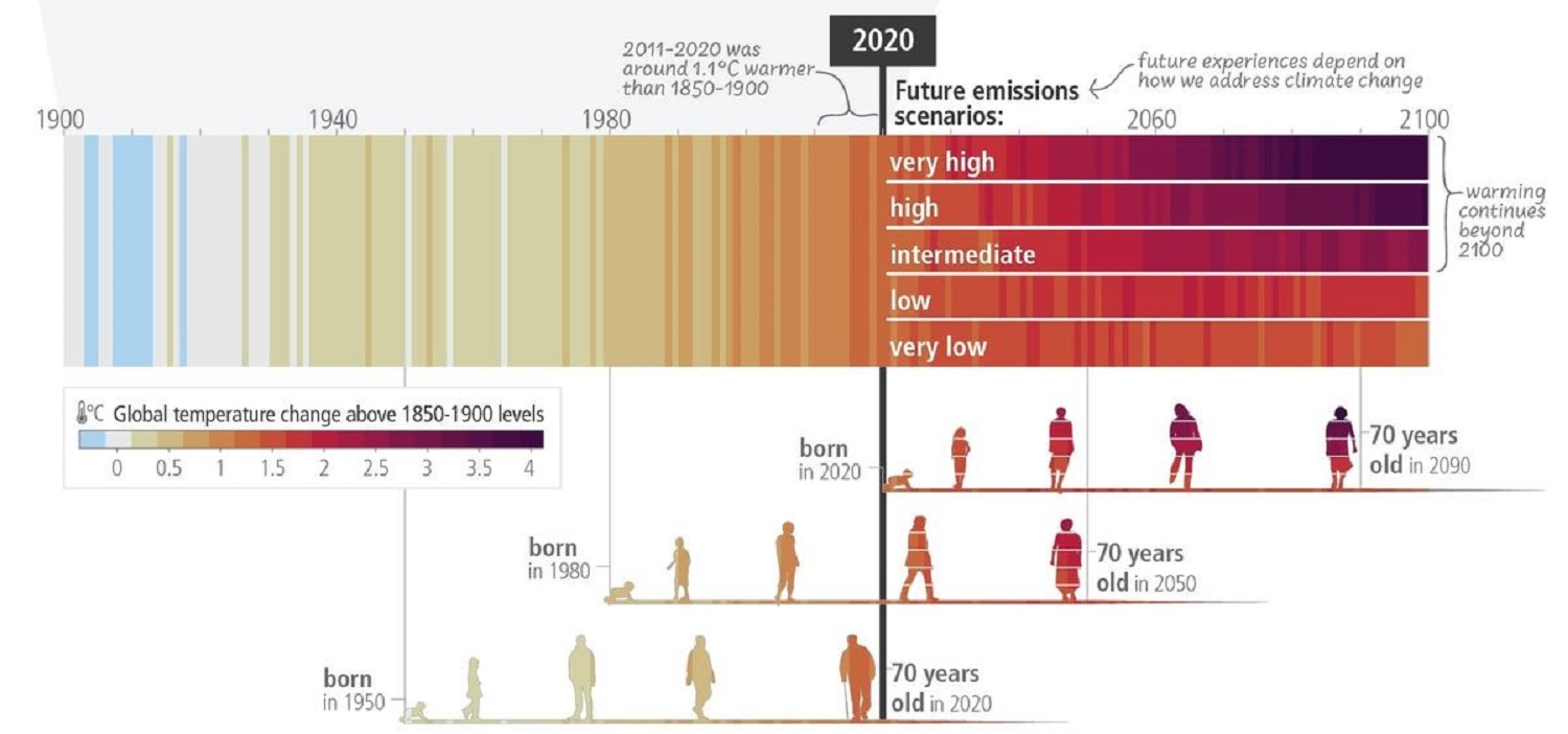
How average global temperatures have changed across generations (Credit: IPCC)
The Europsan Space Agency (ESA) initiated a program called Glacier Mass Balance Inter-comparison Exercise, or Glambie for short. The initiative compiled studies using research measurements and observations from diverse scientific techniques to provide an estimate of the world’s glacial mass loss over the last two decade. The results, published in the journal Nature, show that global ice melting is depleting regional freshwater resources and driving sea levels to rise at ever-faster rates. The ESA created a animation to illustrate the different data methods used, with the Vatnajökull Glacier in Iceland as one example of the cumulative results.
Making major progress working to control atmospheric heating, the driver of climate warming, is the 'take-home' messages from all these global ice melting indicators. WHB